Designing the sales story for an AI product still finding its shape.
The pitch changed while the site was being built. My job was to turn a moving commercial proposition into something a bank could read in one pass, then build it so the next change would not mean starting again.
Narrative, IA, UI, copy, responsive build, design system
maxella.ai
Live page, running
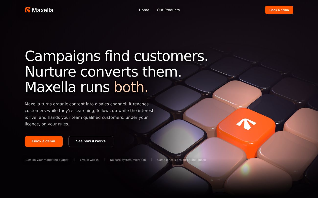
The homepage as it stands today. Everything below is running live, not a screenshot.
The real brief
The question underneath every review was the same one: what exactly are we selling now, and does the website say the same thing?
This was never a one off redesign. The site became the public face of a commercial proposition that was still moving. Pitch updates changed how Maxella described the opportunity, the product structure and the promise, and each one had to land on the page without producing a different website every fortnight.
What kept moving
1
Product model. What is core, what is optional, what is bundled, what is sold separately.
2
Value proposition. What problem Maxella is actually being hired to solve this month.
3
Commercial claims. What the deck promises, qualifies, or quietly leaves out.
4
Sales emphasis. What has to lead for the buyer we are in front of now.
The loop I ended up running
Not a project with a finish line. A loop that had to get cheaper every time it ran.
The page had to sell the problem before it sold the product
I organised the homepage as an argument rather than a feature list. A financial institution should recognise the demand it is already losing first, understand how Maxella reconnects that journey second, and only then see the product structure and what it keeps long term. The demo request comes last, once the buyer has enough context to want the conversation.
The order of the argument
Recognition first, mechanism second, product third. The CTA is the reward, not the opener.
The hard part
Making an invisible product tangible.
Maxella runs across systems an institution already owns. There is no single product screen to photograph, which means the usual portfolio move of showing a dashboard was not available. I used sequence, product roles and physical metaphor instead, without pretending the agent is a standalone SaaS tool.
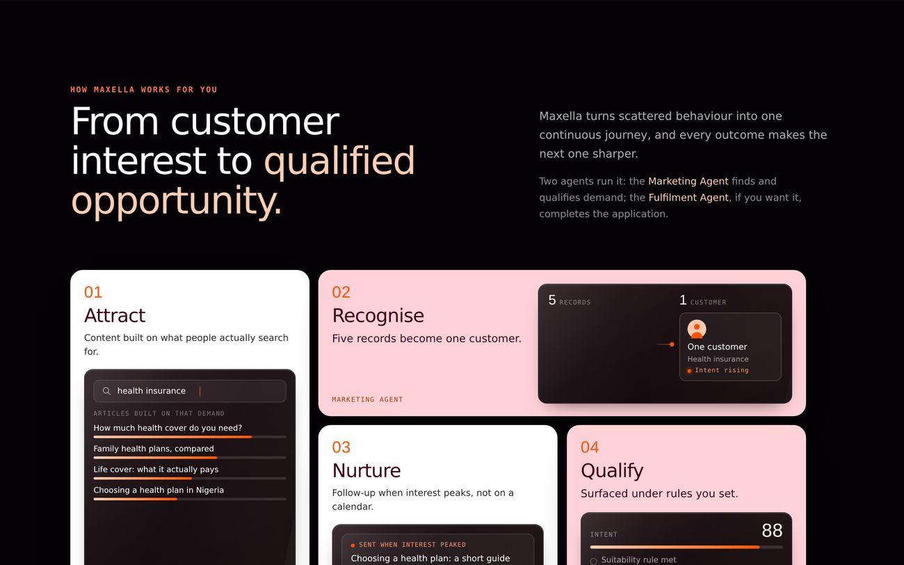
The six stage journey is the load bearing piece. It takes a background process nobody can see and turns it into something a buyer can point at in a meeting.
maxella.ai/#how
Live page, running
The journey section, running live. Hover and it responds, because that is the point of it.
Decision
Product hierarchy is a commercial message, not a label.
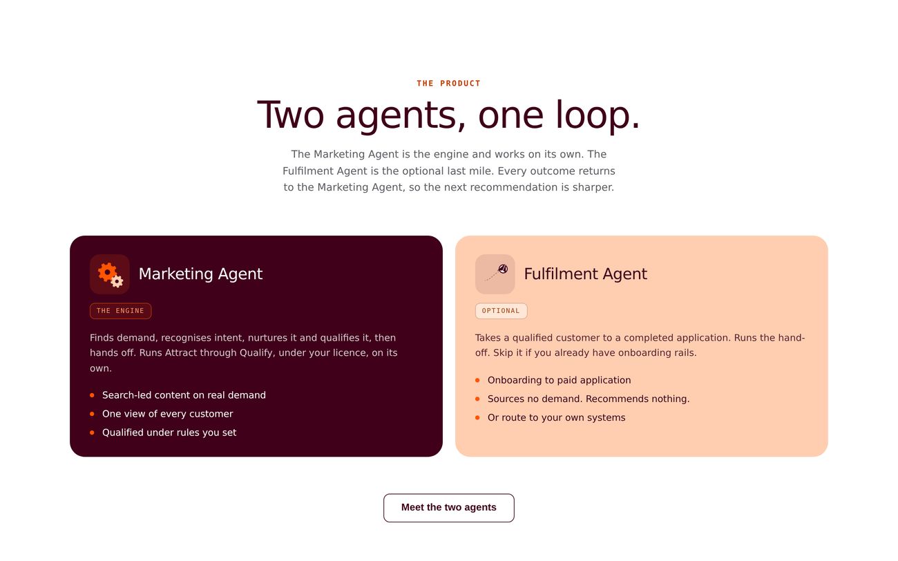
The Marketing Agent finds demand, recognises intent, nurtures and qualifies it. The Fulfilment Agent completes the last mile and is optional. That difference had to be visible immediately, because buyers who assume they must replace their onboarding rails to use Maxella stop reading.
Core and optional are not small words on a card. They change how large the commitment feels.
maxella.ai/#products
Live page, running
Two agents, deliberately unequal. One leads with outcomes, the other is framed as completion.
In a regulated sale, wording is part of the product
Banks, insurers and pension firms do not read a page the way a consumer does. A claim, a recommendation, or an unclear data boundary can create an objection before anyone gets near a demo. So I wrote the constraints down as design rules and held the site to them.
1
Never quote a rate. A public page should not make Maxella look like the regulated adviser.
2
Never imply a recommendation. The institution owns the regulated advice and holds the licence.
3
Never show Maxella deciding for the customer. The visual language has to preserve who owns the regulated action.
I audited the site against the pitch, not the brief
Late in the build I went through the site claim by claim against the commercial deck. It surfaced inconsistent search volume numbers, missing caveats, and a real deliverable I had removed myself because it did not fit the layout neatly.
A tidy interface is not worth a commercial mismatch. If the site says one thing and the contract says another, sales has to repair that trust later, in a room, under pressure. Treating commercial accuracy as part of design QA was cheaper for everyone.
maxella.ai/#advantage
Live page, running
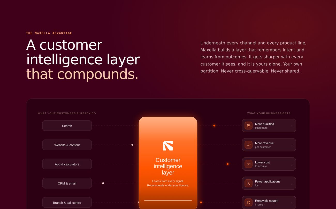
The advantage section answers a trust question as part of the pitch: signals stay inside the institution, and the intelligence layer learns across them.
Built so the next change is cheap
An evolving proposition makes bespoke page design expensive. Midway through I audited the interface and found eight button variants, hard coded headings and inconsistent radii. Every pitch update was quietly costing us a small redesign.
So I moved the site onto named roles: type, colour and components that mean something rather than look a certain way. Orange is the one primary moment on a page. Maroon carries structure. Pink is secondary emphasis. Headings run on a named scale that is responsive by role, not by guesswork.
What the system decides before a new page starts
Colour
One primary moment per page
Orange for attention, maroon for structure and dark panels, pink for support. No page gets to invent a new accent.
Type
H1 to H4, plus fixed text roles
Lead, body and small are roles, not sizes someone picks at build time.
Buttons
Three sizes, two variants
Down from the eight variants the audit found.
Rhythm
Light, dark and off white sections
Section order has rules, so a new page inherits pacing instead of reinventing it.
Mobile
Designed, not interpreted
Responsive rules are explicit. Some diagrams redraw vertically, and true timelines become deliberate swipe experiences rather than squashed desktop layouts.
The product is still changing. The next repositioning should be a content problem, not another round of inventing button heights.
Evidence, honestly
The site went live in September 2026, so there is no conversion data yet and I am not going to invent any. What I can show is what shipped, and the measurement plan I set up before traffic arrived, so the next version of this page can be judged on results rather than intent.
What is true today
A live responsive site that communicates the current proposition instead of the previous pitch.
Product architecture that makes the Marketing Agent core and Fulfilment optional.
Commercial claims reconciled against source material before publication.
A reusable system and explicit responsive rules for future pages.
A front end build engineering can work from rather than reinterpret from static mocks.
What I will measure next
Demo requests per qualified visit, as the first real conversion signal.
Which section the CTA click came from, so we learn which part of the argument creates intent.
Whether buyers accept the problem strongly enough to keep reading past Opportunity.
Marketing versus Fulfilment interest, as the commercial proposition evolves.
Later, demo to qualified opportunity, so the site is judged on sales quality rather than traffic.
What this one taught me
The strongest work here was deciding what the website needed to mean, not what it needed to look like. Listen to the pitch, find the contradiction, make the product legible, protect the regulated boundary, and build something that survives the next version of the story.
Maxella is still evolving. The site is built to evolve with it.
The pitch will change again. That is now a content update, not a redesign.