Case study / nairaCompare

Investments, and the system the rest of the site inherited.

A new financial product, three surfaces, a two week deadline, and one shortcut I refused to take. It became the pattern every category after it was built on.

Role
Lead Product Designer
When
May 2022 – Present
Surfaces
Website, customer portal, admin console
Worked with
Product, engineering, leadership
Carried into
FX, white label FX, Crypto, Diaspora
nairacompare.ng/investments
nairaCompare Investments landing page, showing the hero, the fund category chips and the Maxella AI panel.
  1. 1

    Fund types sit above everything else. The first decision is which kind of investment you are here for, not which provider.

  2. 2

    Maxella, our AI assistant, is placed inside the journey rather than in a floating bubble, for people who do not know the vocabulary yet.

Context

nairaCompare is a marketplace for financial products in Nigeria. People come to compare loans, savings and investments, then apply to whichever provider suits them. Providers list with us because that is where the people are.

When I joined in May 2022, an engineer was designing the screens. It worked, mostly. Forms were long and clumsy, pages did not match each other, and there were spelling mistakes on screens asking people to hand over their money.

Investments was not one screen to draw. It was a lifecycle that had to hold together across three different audiences.

The shape of the problem

Discover and compare Apply Manage Take money out Website Customer portal Admin console public signed in internal Compare funds amount, risk, yield, fee Four step application save and resume Portfolio holdings, maturity, returns Liquidate full or partial Review and approve status, documents, decision Run the book applications, providers, payouts, liquidation requests

One product, three surfaces. Redrawn from how the flow actually runs.

The problem

Investments was the next big bet, and it did not exist yet. It had to live in three places at once: the website where people discover and apply, the customer portal where they manage and liquidate, and the admin console where our team runs it.

Leadership wanted it fast. The fastest path was obvious, which was to build it on the UI we already had.

The call

I pushed back.

The two paths on the table

Two weeks to ship Investments across three surfaces Reuse the interface we had Buys: a faster launch, no argument with leadership Costs: ships the spelling mistakes, the clumsy forms and the mismatched pages into a money product, then repeats them in every category after it NOT TAKEN Design it new, inside the same two weeks Buys: a pattern the next categories can inherit, and a product that looks like it can hold money Costs: visibly more work up front, and a conversation with leadership about why FX and Crypto later shipped on this foundation TAKEN

The argument I made in the room, drawn out after the fact.

On a money product, a misspelled word is not a typo. It is a trust problem.

In a market where every fintech is fighting to be noticed, launching something that looked unfinished was not a shortcut. It was a cost we would pay later.

The deadline did not move. So I had two weeks to design a full product across three surfaces, with proper ideation instead of reuse. It was more work, and it was visibly more work, which is part of why it was an argument. I did it anyway, because a foundation built once could carry every category after it.

Three decisions

01

One journey, not three projects.

I designed Investments as a single lifecycle: find a fund, apply, manage it, take money out. Website, customer portal and admin console were designed together instead of handed off one after another.

Every fund type runs on the same pattern, from money market through to dollar funds. That is why new categories could be added later without redrawing anything.
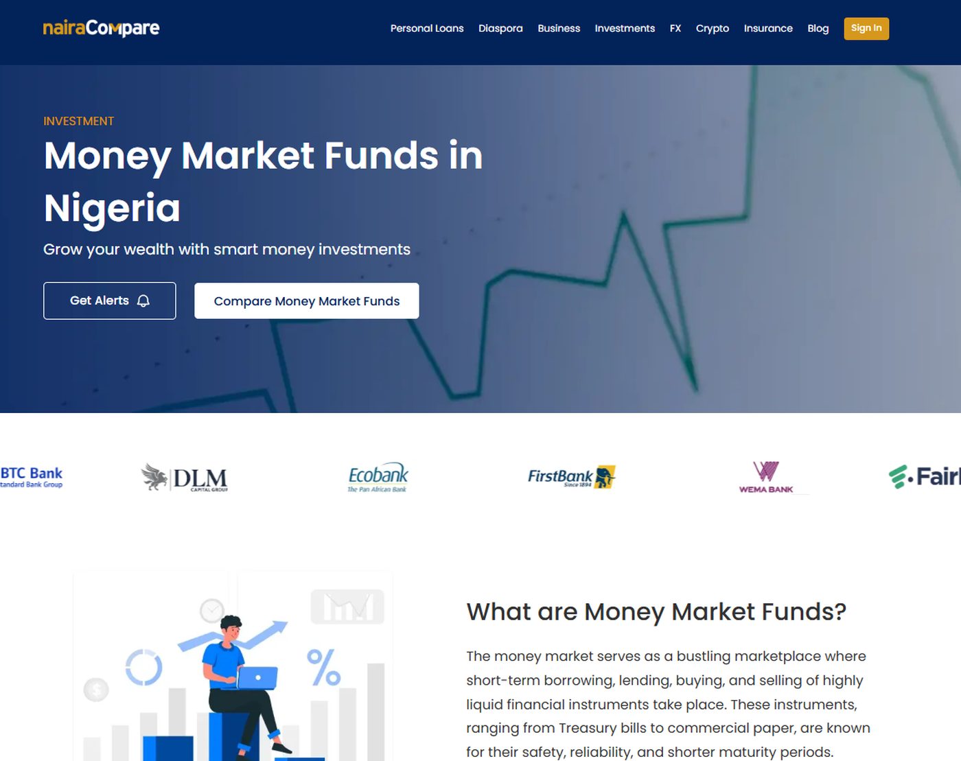
nairacompare.ng/investments/money-market-fund
Money Market Funds sub-page using the same hero, provider strip and explainer structure as the parent Investments page.

Same skeleton, different fund. Six fund types run on this one structure.

Close crop of the six fund category cards.

Detail, the category rail

One component, six entries, and a calculator sharing the same shape. Adding a fund type is a content change, not a redesign.

02

Put the uncomfortable numbers in front of the decision.

The comparison page asks two questions up front, which are how much you want to invest and your risk appetite. Results are then ranked by yield, with the risk profile and the management fee visible on every row.

On a marketplace, hiding the fee until later gets you the click. It also gets you the complaint.

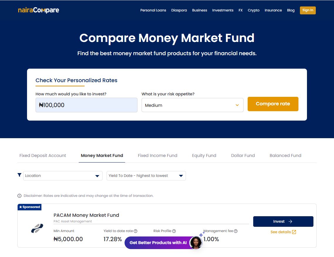
nairacompare.ng/investments/compare/money-market-fund
Money market fund comparison page, with an amount and risk appetite filter at the top and provider rows showing yield, risk profile and management fee.
  1. 1

    Two questions before any results: how much, and how much risk you want. The list that follows is already yours rather than generic.

  2. 2

    Fund types stay as tabs on the results page, so changing your mind does not mean going back to the start.

  3. 3

    Yield, risk profile and management fee sit on the same row as the Invest button. The fee is never one click away from the decision.

Close crop of a single comparison row showing minimum amount, yield to date, risk profile and management fee.

Detail, one result row

Minimum amount, yield, risk profile and fee, with a help cue on each. On a marketplace, hiding the fee until later gets you the click and then the complaint.

03

The form did not need to be shorter. It needed to be survivable.

An investment application asks a lot, and most of it is legally required. So instead of cutting fields, I changed what it takes to get through one. Four steps, with progress visible. Save your details and come back. It works on a phone.

The data since backs that up. On average it takes about 48 hours between starting an application and submitting it, and the longest pause sits right at the start. Nobody fills in an investment application in one sitting. They start it, go and think about it, and come back days later. A form that cannot be left and returned to would lose most of them.

What the data showed later

the long pause, about 18 hours 0 hrs 18 hrs 48 hrs Opens step 1 Investment details Address Payment Submitted application starts done, then they leave Save and resume, plus the reminder email, covers this stretch A single page form with no way back in would lose most of them here

Mixpanel funnel, investment applications. Average time from start to submit.

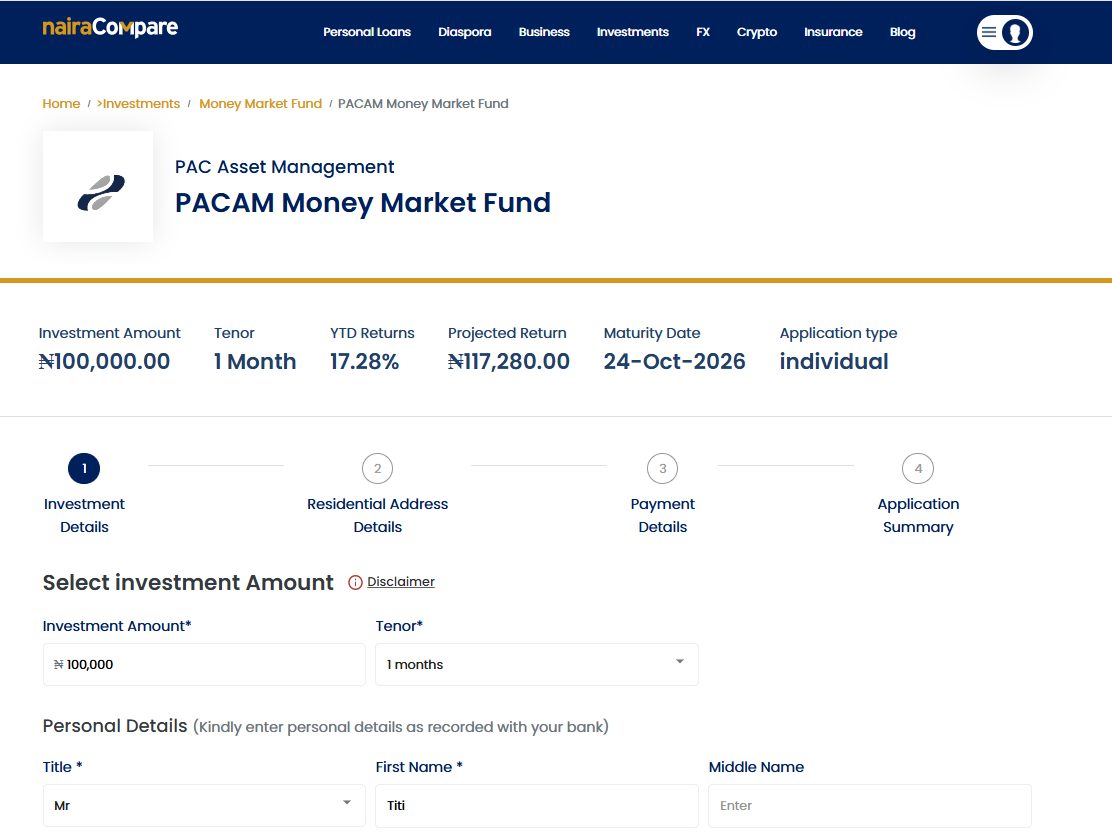
nairacompare.ng/investments/apply
Step one of the investment application, showing the four-step progress indicator and the investment summary pinned above the form.
  1. 1

    What you are committing to stays pinned above the form: amount, tenor, projected return, maturity date. Coming back two days later, you do not have to remember any of it.

  2. 2

    Four named steps, not a progress bar. Named steps tell you what is still coming, which is what decides whether someone starts at all.

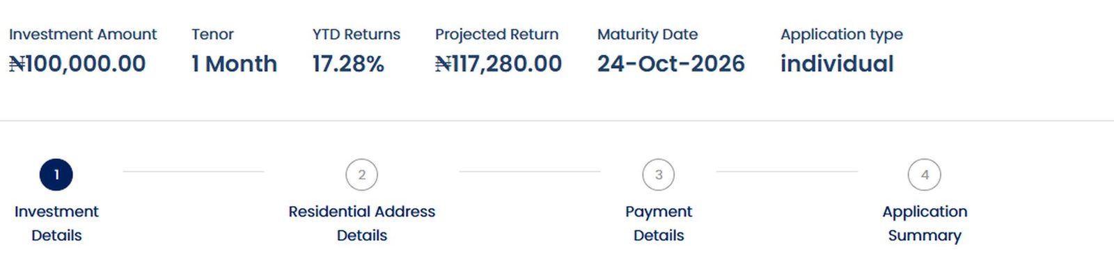
Close crop of the investment summary strip above the four-step progress indicator.

Detail, the commitment strip and steps

The numbers and the route, in the same glance. This strip is why an interrupted application can be resumed without rereading anything.

Where it landed

89,000
unique visitors to Investments over twelve months
Mixpanel, deduplicated
~5%
of them click through to apply
Mixpanel, same period
48 hrs
average time from starting an application to submitting it
Mixpanel funnel

Once Investments shipped, leadership asked for the design to cascade to the other categories.

The bigger change was how we work. Before, ideas went straight to development. Now they go through presentations, feedback loops and high fidelity concepts first. We do not do wireframes here, so I make the idea real enough to argue about before anyone writes code. That process is on every product we build now.

It changed my seat too. I am in ideation with the CEO and MD, and I have demoed concepts to prospective clients.

What came after Investments

  1. Then

    FX

    Next category on the new foundation. I set the direction from day one instead of inheriting one.

  2. Then

    White label FX

    The same engine, dressed for a partner to run as their own.

  3. Then

    Crypto

    Designed by the junior designer on my team. I set direction, reviewed and signed it off.

  4. Then

    Loans, revisited

    Back to the oldest category on the site to bring it up to the standard the newer ones had set.

  5. Now

    Diaspora

    Nigerians abroad, and a different set of assumptions about identity, currency and trust.

Investments was the first. It is not the point. The point is what it made possible.

What carried forward

THE FOUNDATION Investments listing and comparison patterns, sub page structure, application flow, portfolio and admin views FX direction set day one Crypto followed HOW WE WORK NOW Before Idea Development Now We do not do wireframes here, so the concept has to be real enough to argue about. Idea High fidelity concept Feedback loop Development

The foundation, and the process that came with it.

What I would fix next

The Investments application is not the best form on the site anymore. Newer categories got a better one, and Investments has not been migrated. The landing page has not had a proper redesign in two years.

And some of the conversion gap is not mine to close. Design can make applying easy. It cannot make providers say yes.

That is Investments. The rest of the marketplace is built on what it started.